Louise Window Display Design
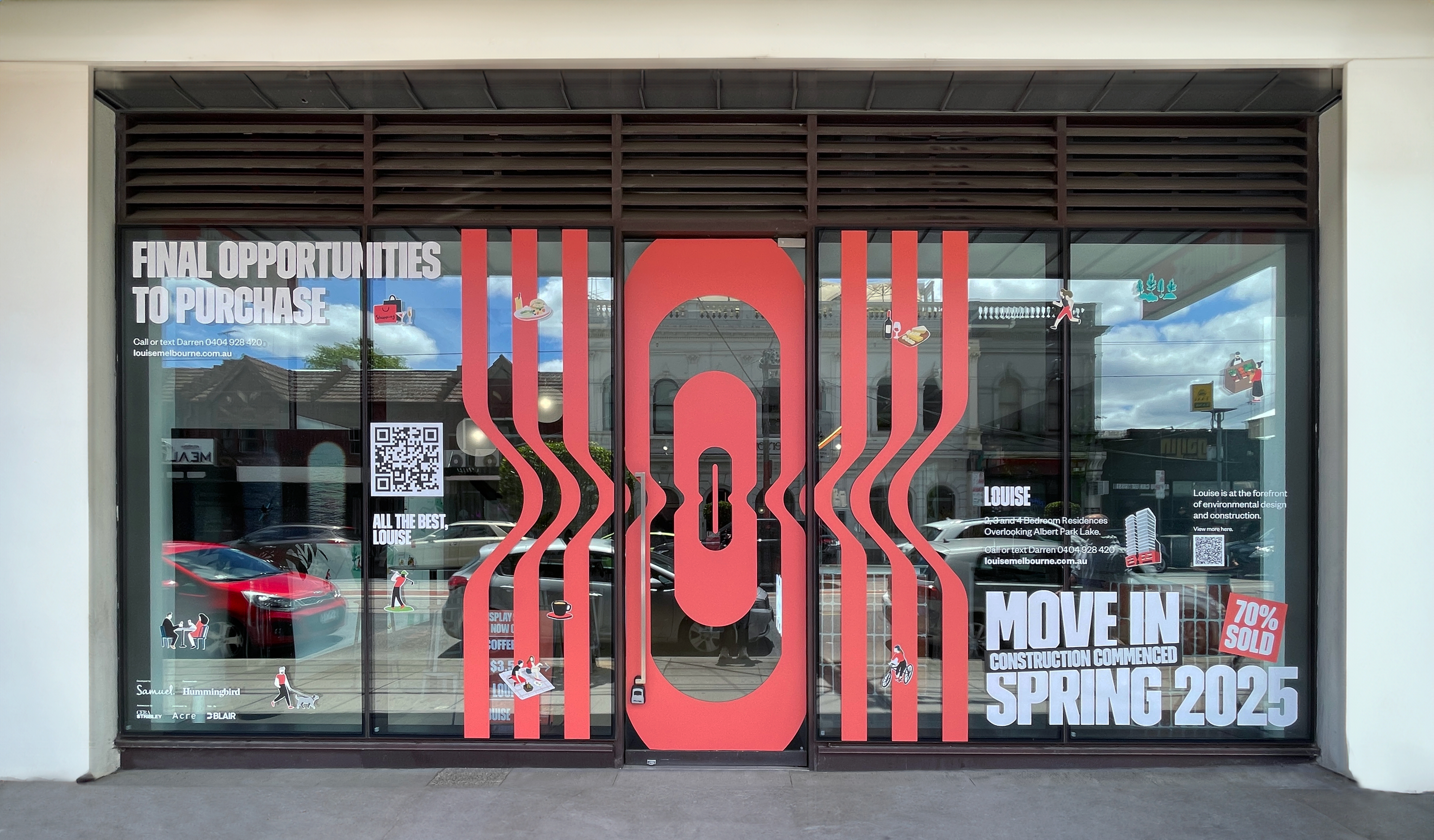
In this dynamic project, I was excited to conceptualise and execute a captivating window display for the display suite office of the prestigious Louise residential building in Albert Park, Melbourne. Tasked with creating an inviting atmosphere that aligned seamlessly with the existing brand guidelines while injecting a sense of innovation, playfulness, and boldness, my objective was to entice passersby to step into the display suite and explore the offerings of this new residential development.
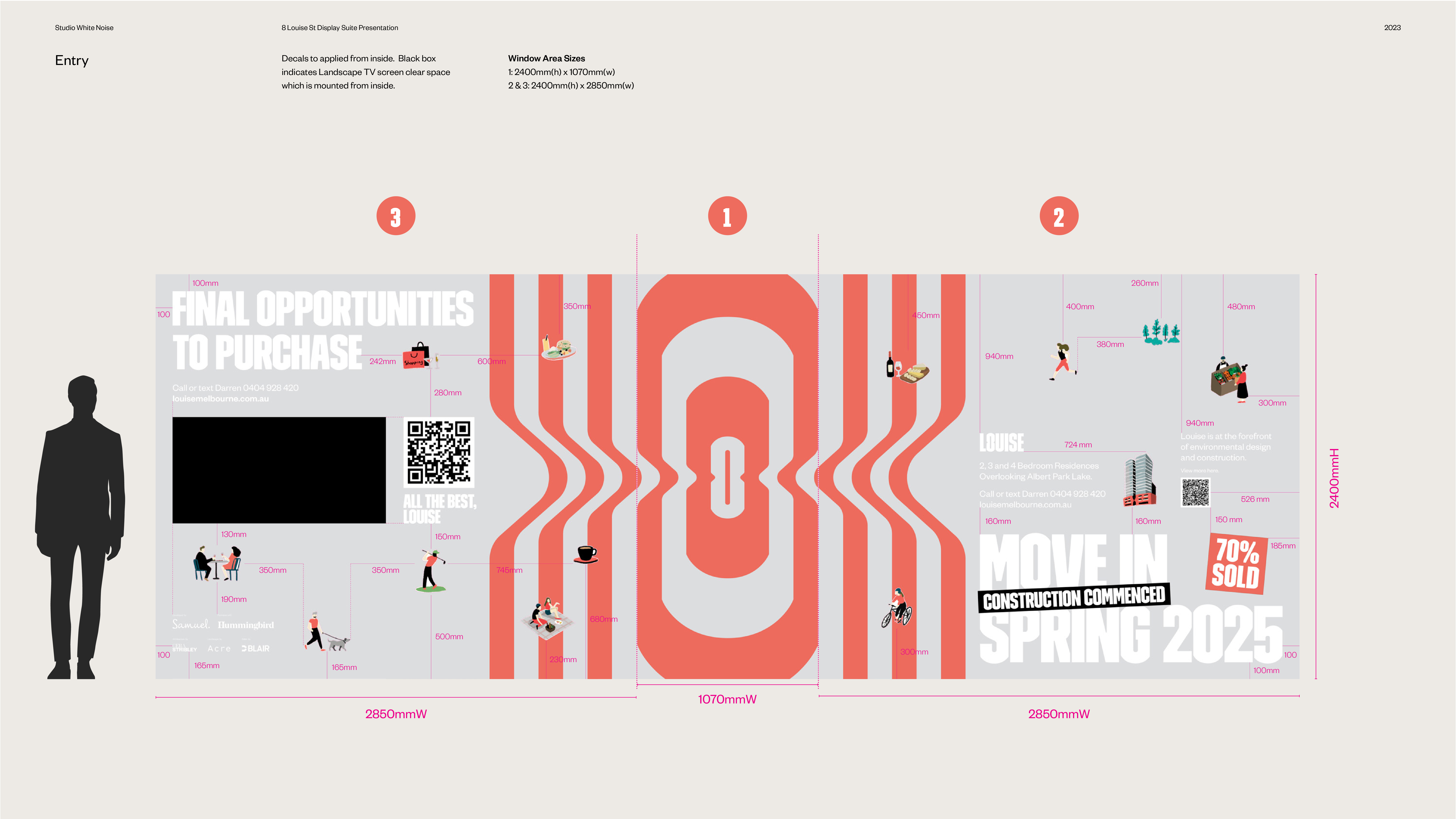
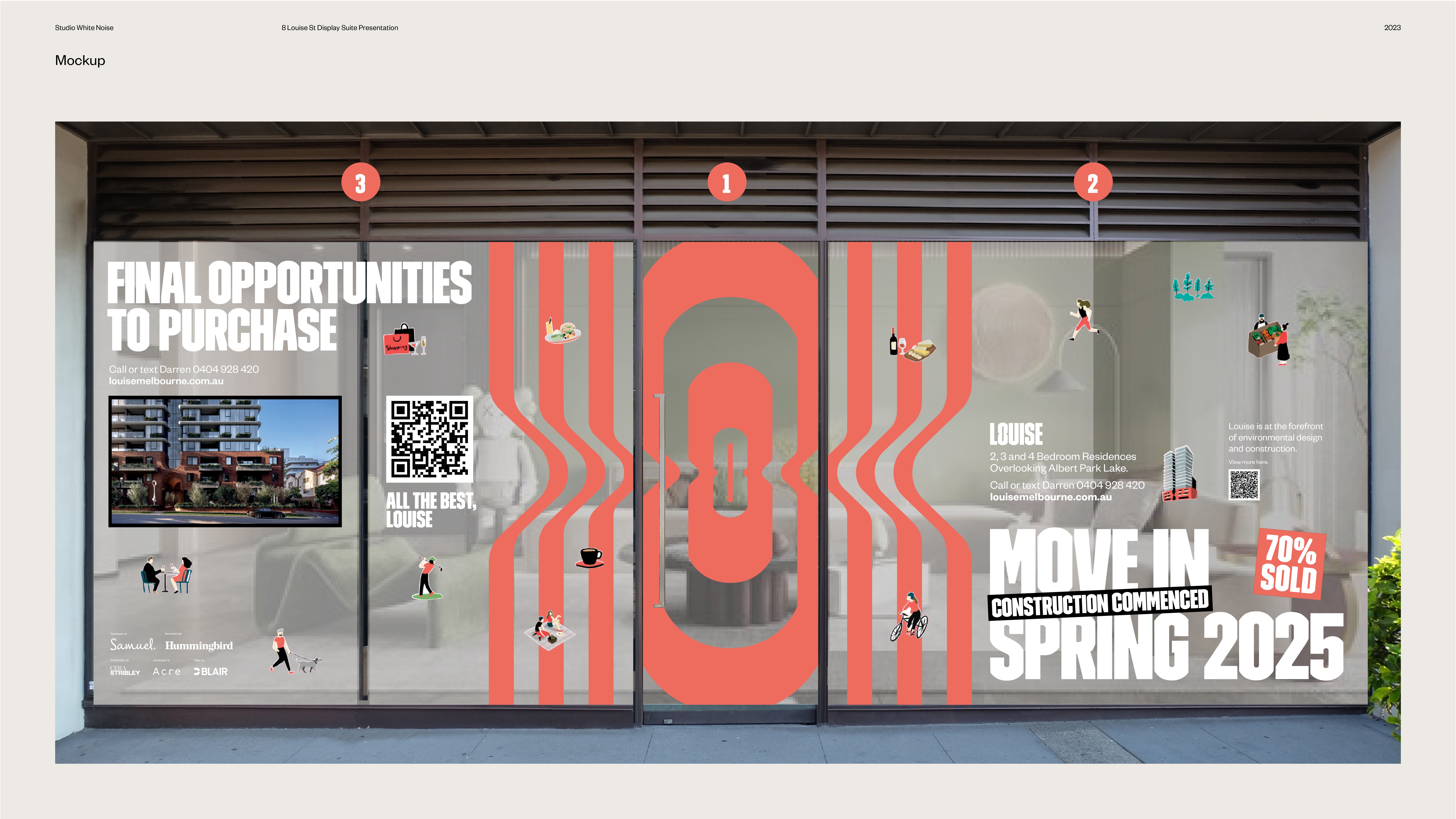
Drawing inspiration from the monogram of the Louise logo, the design centred around a repeated pattern derived from the elegant curvature of the letter ‘O.’ This motif was strategically applied as a decal on the entrance door, acting as a visual magnet to draw attention and curiosity. The design aimed to serve as a subconscious beckoning, inviting individuals to discover more about the apartments.
Typography was crucial in conveying the brand’s lifestyle and identity messaging, offering insights into the unique features and experiences of the Louise apartments and using existing illustration assets as storytelling to showcase the vibrancy of the Albert Park neighbourhood, featuring key attractions, landmarks, activities, and highlights. By incorporating these elements, the window display not only communicated the lifestyle offered by Louise but also provided valuable information about the surrounding environment, enriching the viewer’s understanding of the community they could become a part of.
The result was a dynamic, immersive window display that successfully fulfilled the client’s vision of an innovative, fun, and attention-grabbing showcase. Through the thoughtful integration of brand elements, typography, and illustrations, the design effectively sparks interest, drives foot traffic, and ultimately invites prospective residents to engage with the Louise experience. This project is a testament to my ability to translate brand identity into visual narratives that resonate with the target audience.
2023 Work @ Studio White Noise