Melbourne Queer Film Festival
Concept design for the Melbourne Queer Film Festival brand identity proposal.
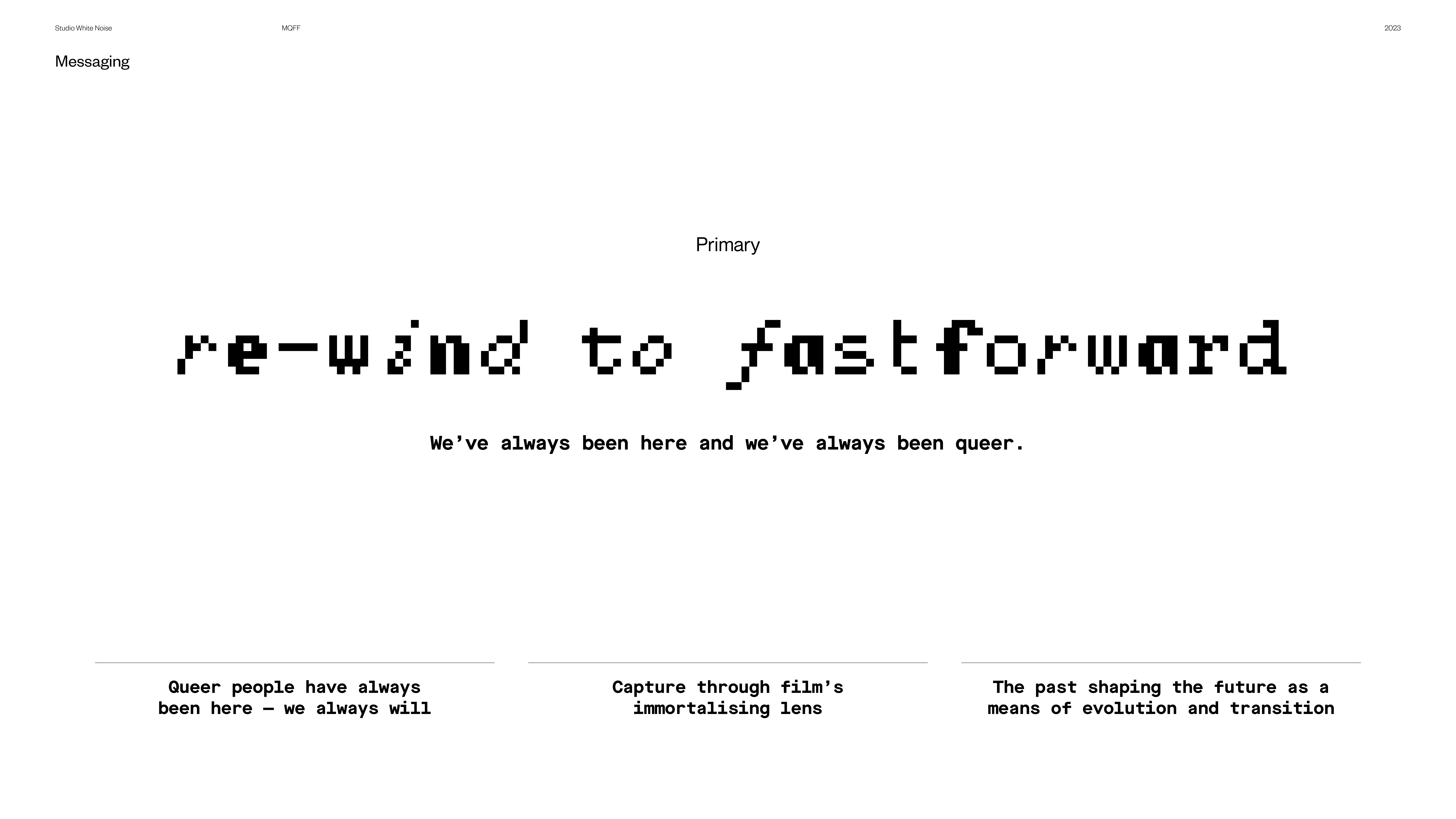
For the Melbourne Queer Film Festival (MQFF), I undertook the challenge of crafting a design that echoed nostalgia, complexity, and a VHS aesthetic while incorporating rainbow colours symbolic of the LGBTQIA+ community. Embracing the theme “Re-wind to Fast-forward,” my conceptualisation aimed to spotlight the historical significance of queer films, weaving together elements of fragmentation, pixelation, and glitch effects reminiscent of old television and film charm.
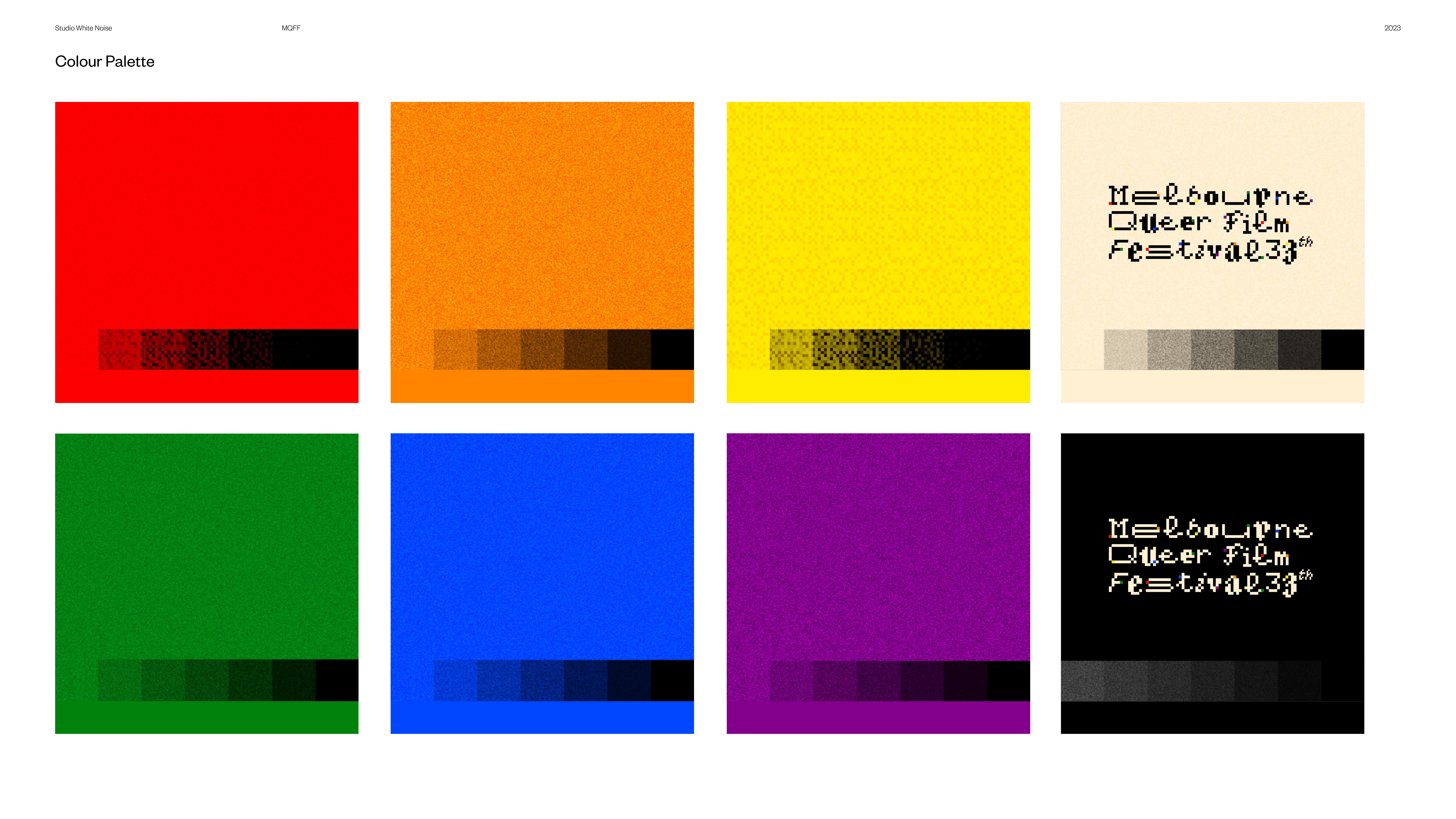
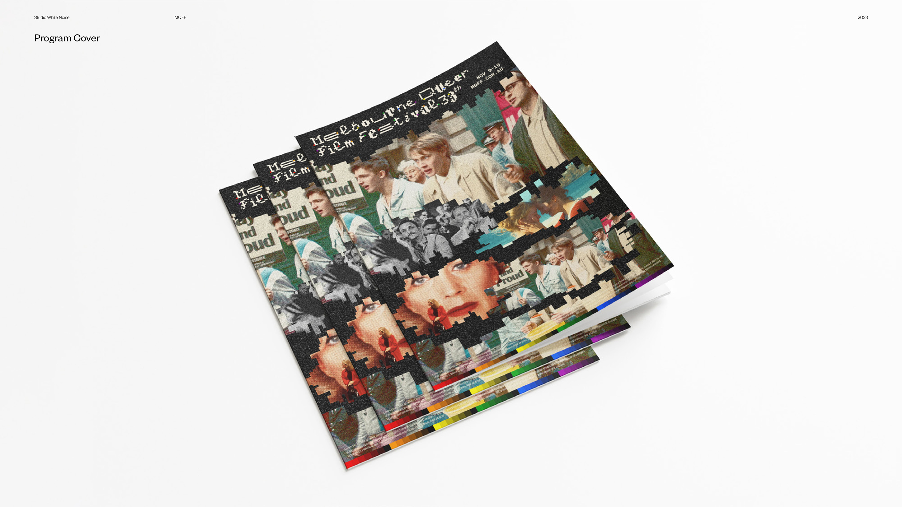
The logo design, featuring a pixel typeface, was a visual anchor, encapsulating the festival’s theme. Monochrome and colour film photographs of queer films were seamlessly integrated with fragmented pixelated graphics and analogue noise elements, constructing a compelling visual language. The chosen brand colours represent each gender within the LGBTQIA+ community to the symbolic significance of the rainbow.
This design seamlessly extended across diverse collateral, including posters, program designs, tote bags, tee designs, and social media posts. The comprehensive and cohesive visual identity fulfilled the client’s quest for a nostalgic and complex aesthetic and effectively communicated the festival’s overarching theme. It celebrated the enduring legacy of queer cinema by thoughtfully integrating visual elements and maintaining thematic coherence.
In essence, this concept design served as a fitting representation of the Melbourne Queer Film Festival, encapsulating the rich history and storytelling essence of the LGBTQIA+ community.
2023 Work @ Studio White Noise


